Thursday, 25 March 2010

Uploaded to youtube...


I uploaded my film trailer onto youtube publicly so any persons who visit the site are able to watch my film trailer. I also included below information about copyright act 1988. which says, "Every effort has been made to contact copyright holders and we apologise if any have been overlooked. Should copyright have been unwittingly infringed in this production, the owners should make contact with me, and I will try to make the wanted corrections". As you can see below, so far my film teaser trailer has recieved 51 views!!

Tuesday, 23 March 2010

Prezi.com

Today is the first day ive started using the bizarre yet amazing website prezi.com. For my media evaluation I will be using prezi to present my evaluation of my A2 media product and ancillary texts. The evaluation questions are as followed...
1.) In what ways does your media product use, develop, or challenge forms and conventions of real media texts?
2.) What have you learned from your audience feedback?
3.) how effective is the conbination of your main product & ancillary texts?
4.) How did you use new media technologies in the construction & research, planning and evaluation stages?

So far with my prezi presentation evaluation slide I have arranged the questions around the page & put them into frames.. I then also managed to embed my finished product on youtube onto my prezi!! (& yes I had to ask google how to do this)...

Ive now completed my prezi.. i hope you enjoy!

Wednesday, 10 March 2010

The final touches

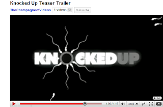
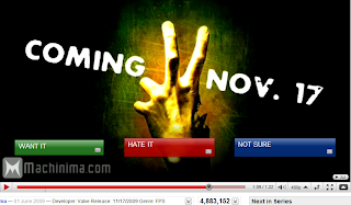
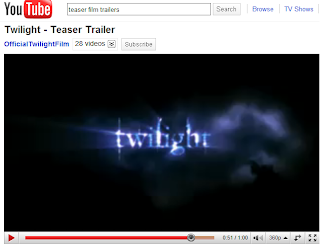
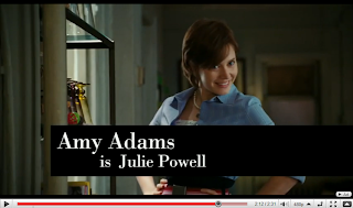
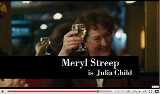
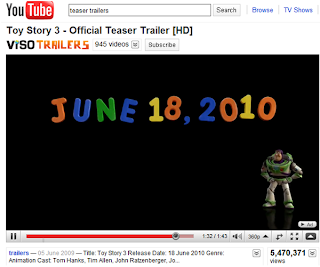
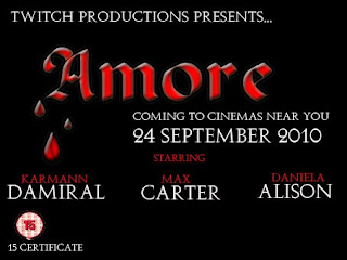
Now my teaser trailer Amore has been fully filmed & edited with my happy satisfaction, it is important to me to add the final authentic touches of which are included in real media trailers to make mine authentic also. The authentic touches I had in mind were to include a release date showing audiences what date it comes out in cinemas, the age certificate, title, tagline, the Production Company & names of the star actors & actresses. During my research I was noticing what materials and information were being obtained through these trailers & how this was shown to the audience. Below are some screen print examples of my research:


Here is an example of some very popular and familiar films trailers from twilight to the new toy story 3. Each have similar information features which include stars, title & release date. After looking at teaser film trailers I noticed that most keep the information short and simple, this will prevent audiences loosing concentration and is good advice for my film trailer.

Originally I wanted to include this information in my teaser trailer a few seconds after the picture burns in my video. The image I had in my head was for the picture to be burning of the married couple and then the picture fades slowly into the background with the title, release date and stars along with age certificate to appear in red writing, this would then integrate into my film trailer looking authentic and professional.

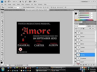
However, after hours and hours of trying my partner and me were unable to perform this idea :(, the version of Photoshop our school provides is technically not capable, we needed a newer version which the apple Mac laptops did not provide. Very saddened my only alternative was to simply create a new clip with this information and place it into my film trailer, although at first I wasn’t happy with this idea, once the trailer had been created it looked just as professional if not even more & during the process I have gained many new skills such as learning to save the picture to a Jpeg document so the sizing would be a match in my film trailer.


This was inserted as a still image clip transferred to my film trailer at the end, After all the hassle and problems I had with Photoshop & this image i am very pleased to be able to include it into my film trailer, I hope you like it.

Sunday, 28 February 2010

HomeWork...

Personal Homepages & the construction of identity on the web summary By Daniel Chandler.

Media theories such as Joshua Meyrowitz (1985) have created ideas that suggest new media seems to involve a shifting or blurring of the boundaries of public and private, ‘automatically’ publishing information on a global scale. Daniel Chandler’s research frequently indicates that the web is often’ misleadingly’ in terms of being a global source of information. The authors of these increasingly fast growing web homepages are allowed to shape, express, convey and omit their writing displaying their personal reflexion of themselves, known as ‘virtual selves’ and what some might call ‘self-advertisement’. (Quote from Paul, A British homepage author). Similarly Thomas Erickson(1996) notes that personal homepages and the world wide web are not being used to ‘publish information’ but they are being used to construct identity of one’s self.

Critics would argue that personal home pages & the construction of identities on the web are ‘misleading’ yet again. This medium appears to be open to mass producers as well as mass consumers and Synchronous modes of communication such as the telephone and face-to-face involve ‘real time’ unlike asynchronous communications just like personal homepages, where face-to-face interactions such as facial expression, vocal cues, body language, posture, gestures and non-verbal mannerisms together with style of dress and hairstyle is not recognized nor judged. Steven Rubio (1996) complains ‘When you visit my homepage, you don’t get to meet me, but only my presentation of myself.’ Although this quote is truthful, with the World Wide Web never before being available to so many people, allowing authors to construct selective personal identity may possibly be unsafe for audiences of the web especially within youth culture, audiences should be wary of personal identities to prevent a moral panic of homepages appearing ‘dangerous’ due to the authenticity of relationships.

Daniel Chandler’s research additionally illustrates positive aspects of personal homepages constructing identity. Personal homepages allows freedom to not only authors but also audiences where both can relate to one another, this transforms individuals to the inner selves where they can escape their average day and exist to who they desire. This also allows authors to publish feelings helping to validate themselves, with unspoken questions such as “Who am I?”. Personal homepages attentively marginalize groups in quite specific characteristics, by means with the world becoming more and more variable, compliant and dynamic everyday day with being Gay, bisexual, a second generation British Asian, a disabled women the World Wide Web is becoming a dependant technology. Rob in London, “ A very easy way for me to come out, I could say ‘check out my web site’ and knew they’d come across the gay part. More importantly, they could find out in my own positive terms and think about it before reacting.” For David, other gay Britain, his “confession page”. Personal home pages can explore ‘deeper’ motives such as audiences finding new friendship and dating opportunities and audiences finding a ‘personal and intellectual connection not just physical connection’ where physical connection is more likely in face-to-face interactions.

Regardless of the trend of personal home pages in sites such as Facebook, Myspace, Bebo & many more there is still a difference between construction of real life interaction and web identity. People like Turkle, (1996) explain you have to live the experience of real life. Personal homepages create a sense of identity, whether it being a sense of belonging or simply just to be heard by someone to express themselves. The internet has a mass audience which consecutively makes the information by authors very public, which often manipulates their public identities on the web.

Sunday, 21 February 2010

Photoshop - Creating My Film Magazine

After currently researching Film magazine front covers and their conventions, I have decided I want one dominate lone fairly simplistic image with an eventful background such as: city buildings, beach scenery or forest scenery. I came to reach this idea by noticing the ‘popular’ & successful film magazine brands such as ‘Total Film’ & ‘Empire’ use this technique. By using this image of background it will instantly attract my target audience for this magazine. As my personal film is the feature of this magazine I will show off & exaggerate the title of my film along with a tease of stimulating gossip!

Opening up Photoshop was nightmare! so many saved documents I was confusing myself just trying to find the Photoshop background I started working on for my film Magazine...


This picture was PERFECT...just the background I was trying to create. The only thing I needed to change about it was the colour of the background. Thankfully changing the colour like I did my film poster didnt take half the time as I had been on Photoshop for what seemed forever.


Here I wanted a dark effect to match the genre of my film THRILLER..so the writing on my magazine would bold, clear an easy to read as well as standing out.

Choosing the magazine film title

I had the background image colour ajusted when I realised I need a magazine title! For the first half hour nothing 'special' came to mind. I typed into google 'media film terminology' (http://www.screenonline.org.uk/education/glossary.html) & to my surprise nothing jumped out for me to name my magazine. I was getting a little Impatient and Irritated so I decided to play around on Photoshop with other tasks that needed to be completed. unexpectedly whilst using the 'zoom' button I had a brain wave..to call my magazine ZOOMED. In my case zoomed is used as a Metaphor, instead of as the usual and normal meaning to zoom into a picture... my magazine is zooming into the film industry taking a closer inside look!

My next idea was to create a title on a website & shimmer it up to look profession. In theory my idea seemed good.. but the title's I had created had an impractical element that I didnt want so I went back onto good old Photoshop.


Here a screen print of www.fonts.com... this site was not too helpful so I tryed www.dafonts.com which was much more practical & realistic, but as you can see below not quite 'professional' enough compared to photoshop.

Here is a selection of other images & other desires I wanted my Film Magazine to include please click on link on the image below: