Thursday 25 March 2010

Uploaded to youtube...


I uploaded my film trailer onto youtube publicly so any persons who visit the site are able to watch my film trailer. I also included below information about copyright act 1988. which says, "Every effort has been made to contact copyright holders and we apologise if any have been overlooked. Should copyright have been unwittingly infringed in this production, the owners should make contact with me, and I will try to make the wanted corrections". As you can see below, so far my film teaser trailer has recieved 51 views!!

Tuesday 23 March 2010

Prezi.com

Today is the first day ive started using the bizarre yet amazing website prezi.com. For my media evaluation I will be using prezi to present my evaluation of my A2 media product and ancillary texts. The evaluation questions are as followed...
1.) In what ways does your media product use, develop, or challenge forms and conventions of real media texts?
2.) What have you learned from your audience feedback?
3.) how effective is the conbination of your main product & ancillary texts?
4.) How did you use new media technologies in the construction & research, planning and evaluation stages?

So far with my prezi presentation evaluation slide I have arranged the questions around the page & put them into frames.. I then also managed to embed my finished product on youtube onto my prezi!! (& yes I had to ask google how to do this)...

Ive now completed my prezi.. i hope you enjoy!

Wednesday 10 March 2010

The final touches

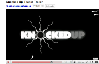
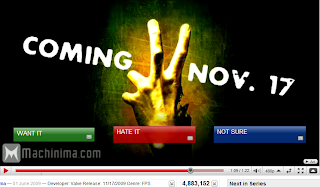
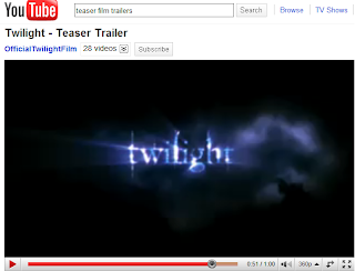
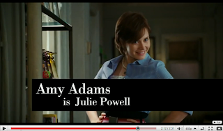
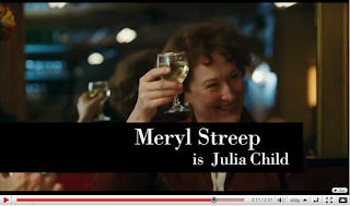
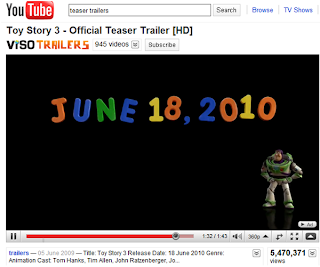
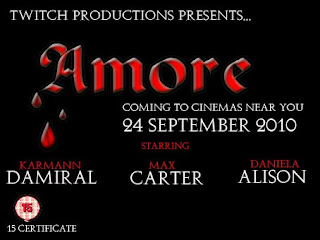
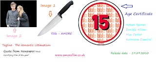
Now my teaser trailer Amore has been fully filmed & edited with my happy satisfaction, it is important to me to add the final authentic touches of which are included in real media trailers to make mine authentic also. The authentic touches I had in mind were to include a release date showing audiences what date it comes out in cinemas, the age certificate, title, tagline, the Production Company & names of the star actors & actresses. During my research I was noticing what materials and information were being obtained through these trailers & how this was shown to the audience. Below are some screen print examples of my research:


Here is an example of some very popular and familiar films trailers from twilight to the new toy story 3. Each have similar information features which include stars, title & release date. After looking at teaser film trailers I noticed that most keep the information short and simple, this will prevent audiences loosing concentration and is good advice for my film trailer.

Originally I wanted to include this information in my teaser trailer a few seconds after the picture burns in my video. The image I had in my head was for the picture to be burning of the married couple and then the picture fades slowly into the background with the title, release date and stars along with age certificate to appear in red writing, this would then integrate into my film trailer looking authentic and professional.

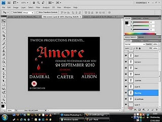
However, after hours and hours of trying my partner and me were unable to perform this idea :(, the version of Photoshop our school provides is technically not capable, we needed a newer version which the apple Mac laptops did not provide. Very saddened my only alternative was to simply create a new clip with this information and place it into my film trailer, although at first I wasn’t happy with this idea, once the trailer had been created it looked just as professional if not even more & during the process I have gained many new skills such as learning to save the picture to a Jpeg document so the sizing would be a match in my film trailer.


This was inserted as a still image clip transferred to my film trailer at the end, After all the hassle and problems I had with Photoshop & this image i am very pleased to be able to include it into my film trailer, I hope you like it.

Sunday 28 February 2010

HomeWork...

Personal Homepages & the construction of identity on the web summary By Daniel Chandler.

Media theories such as Joshua Meyrowitz (1985) have created ideas that suggest new media seems to involve a shifting or blurring of the boundaries of public and private, ‘automatically’ publishing information on a global scale. Daniel Chandler’s research frequently indicates that the web is often’ misleadingly’ in terms of being a global source of information. The authors of these increasingly fast growing web homepages are allowed to shape, express, convey and omit their writing displaying their personal reflexion of themselves, known as ‘virtual selves’ and what some might call ‘self-advertisement’. (Quote from Paul, A British homepage author). Similarly Thomas Erickson(1996) notes that personal homepages and the world wide web are not being used to ‘publish information’ but they are being used to construct identity of one’s self.

Critics would argue that personal home pages & the construction of identities on the web are ‘misleading’ yet again. This medium appears to be open to mass producers as well as mass consumers and Synchronous modes of communication such as the telephone and face-to-face involve ‘real time’ unlike asynchronous communications just like personal homepages, where face-to-face interactions such as facial expression, vocal cues, body language, posture, gestures and non-verbal mannerisms together with style of dress and hairstyle is not recognized nor judged. Steven Rubio (1996) complains ‘When you visit my homepage, you don’t get to meet me, but only my presentation of myself.’ Although this quote is truthful, with the World Wide Web never before being available to so many people, allowing authors to construct selective personal identity may possibly be unsafe for audiences of the web especially within youth culture, audiences should be wary of personal identities to prevent a moral panic of homepages appearing ‘dangerous’ due to the authenticity of relationships.

Daniel Chandler’s research additionally illustrates positive aspects of personal homepages constructing identity. Personal homepages allows freedom to not only authors but also audiences where both can relate to one another, this transforms individuals to the inner selves where they can escape their average day and exist to who they desire. This also allows authors to publish feelings helping to validate themselves, with unspoken questions such as “Who am I?”. Personal homepages attentively marginalize groups in quite specific characteristics, by means with the world becoming more and more variable, compliant and dynamic everyday day with being Gay, bisexual, a second generation British Asian, a disabled women the World Wide Web is becoming a dependant technology. Rob in London, “ A very easy way for me to come out, I could say ‘check out my web site’ and knew they’d come across the gay part. More importantly, they could find out in my own positive terms and think about it before reacting.” For David, other gay Britain, his “confession page”. Personal home pages can explore ‘deeper’ motives such as audiences finding new friendship and dating opportunities and audiences finding a ‘personal and intellectual connection not just physical connection’ where physical connection is more likely in face-to-face interactions.

Regardless of the trend of personal home pages in sites such as Facebook, Myspace, Bebo & many more there is still a difference between construction of real life interaction and web identity. People like Turkle, (1996) explain you have to live the experience of real life. Personal homepages create a sense of identity, whether it being a sense of belonging or simply just to be heard by someone to express themselves. The internet has a mass audience which consecutively makes the information by authors very public, which often manipulates their public identities on the web.


Sunday 21 February 2010

Photoshop - Creating My Film Magazine

After currently researching Film magazine front covers and their conventions, I have decided I want one dominate lone fairly simplistic image with an eventful background such as: city buildings, beach scenery or forest scenery. I came to reach this idea by noticing the ‘popular’ & successful film magazine brands such as ‘Total Film’ & ‘Empire’ use this technique. By using this image of background it will instantly attract my target audience for this magazine. As my personal film is the feature of this magazine I will show off & exaggerate the title of my film along with a tease of stimulating gossip!

Opening up Photoshop was nightmare! so many saved documents I was confusing myself just trying to find the Photoshop background I started working on for my film Magazine...


This picture was PERFECT...just the background I was trying to create. The only thing I needed to change about it was the colour of the background. Thankfully changing the colour like I did my film poster didnt take half the time as I had been on Photoshop for what seemed forever.


Here I wanted a dark effect to match the genre of my film THRILLER..so the writing on my magazine would bold, clear an easy to read as well as standing out.

Choosing the magazine film title

I had the background image colour ajusted when I realised I need a magazine title! For the first half hour nothing 'special' came to mind. I typed into google 'media film terminology' (http://www.screenonline.org.uk/education/glossary.html) & to my surprise nothing jumped out for me to name my magazine. I was getting a little Impatient and Irritated so I decided to play around on Photoshop with other tasks that needed to be completed. unexpectedly whilst using the 'zoom' button I had a brain wave..to call my magazine ZOOMED. In my case zoomed is used as a Metaphor, instead of as the usual and normal meaning to zoom into a picture... my magazine is zooming into the film industry taking a closer inside look!

My next idea was to create a title on a website & shimmer it up to look profession. In theory my idea seemed good.. but the title's I had created had an impractical element that I didnt want so I went back onto good old Photoshop.


Here a screen print of www.fonts.com... this site was not too helpful so I tryed www.dafonts.com which was much more practical & realistic, but as you can see below not quite 'professional' enough compared to photoshop.

Here is a selection of other images & other desires I wanted my Film Magazine to include please click on link on the image below:

Photoshop - Creating My Film Poster

Unlike my Film Magazine I wanted my Film Poster to be contrasted from my magazine. I want my poster to be enclosed with plenty of activity, eventful images and text about Amore. I think it would be good for my poster to be lively, eye catching in order to advertise my film from its and capture audience’s attention. I want to emphasize the characters & the plot so make sure the poster will not come across as ‘boring’. My film poster should exaggerate the film genre to create the attention of potential of niche target audiences. Similarly to my Film Magazine I will include the usual film poster conventions.

Photoshop help!!

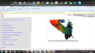
Once again I was back to square one... New updated Photoshop that I have no idea how to use. Thankfully Photoshop provided me with a simple "how to use Photoshop" which enabled me to follow a web link on Photoshop tutorial using a step-by-step set up technique,(www.Adobe\Photoshop CS\Help\help.html). To begin with experimenting with Photoshop seemed fun and I was feeling fairly ambitious & excited. I started to build the foundation of my film poster.


Clouds Background

From my previous Photoshop tasks they all have a similar pattern of using a plain background which had an element of dullness. I want more of a challenge for my film poster & film magazine. From my Research of Questionnaires to potential customers at my research stage almost all of them agreed that if I apply having an eventful & lively background they would be much more inclined to be interested about AMORE. Therefore I learned from this that I need to make my film poster look different, catchy and busy, I decided to have a background of clouds with a sense of obscurity with a slight sinister atmosphere theme. As you can see below originally I took some pictures of the sky with some clouds. Luckily the last few weeks have been fairly sunny so it gave me my perfect opportunity to test out my photography skills!

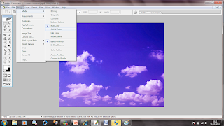
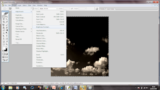
When taking these pictures in my head I knew they obviously couldn't be blue with happy approach on my film poster so I hoped to changed this on Photoshop which was a success. At first I just changed the shade of blue to a darker contrast & and red tint.... Unfortunately this did not fulfil the image of my background I had in my head so my work was cut out for me, trying to figure out how to make the clouds appear black!

Here is a copy of the original image, background image sky blue with cloud theme.


Here I have applied a darker contrast & a red tint, In my head this wasn't the colour i was hoping for so i was not fully satisfied... to me it almost looks like sunset coming and not the background foundation to a thriller film such as mine.

This picture makes Photoshop look fairly simplistic to use & navigate effectively. BUT the first few hours of reuniting yourself with Photoshop is not like this. I found using "layers" complex and at times confusing with such a simple task.

This is what I was aiming for! a dark background image with a inscrutability appeal!

Karman's Photograph- An awkward job of cutting her out for the background


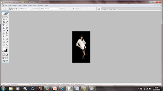
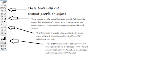
Very zoomed in for Maximum effect cutting out an actor for my film was very tricky due to the detail. As it was my first major task I attempted to experiment with all Photoshop buttons just to check it would look as professional as I could possibly make it. I found a number of similar buttons that to me done almost the same thing: To cut Karmann out I found the most appropriate tool which was the MAGNETIC LASSO TOOL...absolute life saver although I found it can be quite time consuming.

Here is a vague list of the button organisation for tools... originally I used this guild to help me when going through Photoshop.


Here is a selection of other images & other desires I wanted my Film Poster to include please click on link on the image below:

Saturday 20 February 2010

Photo's For The Film Magazine & Film Poster

Here is a selection of pictures I took over the duration of our filming dates, however due to the long day we (myself and actors) had, our make-up and clothes were not as high-quality as I would of liked. The actor’s make-up had faded and the clothes were a little creased & the poor lighting made the actors look very pale. I learnt from this experience that planning a day to just concentrate on pictures would be a clever idea, I took more pictures of improved scenery, such as forestry area and plain brick walls as you can see below. Organising a day to focus on only pictures allowed them to look fresh, thorough and of high quality making my film poster and film magazine more outstanding and eye catching to audiences.


Wednesday 17 February 2010

Naming My Film Trailer

My Film trailer is based on... A wife, a cheating husband & his mistress... When the wife discovers her husband’s secret & turns psycho, playing the role of a deadly killer! Thinking of name for my film trailer was beyond challenging and demanding. I wanted a simple aristocratic one-worded word for the title that stood out from other films but had an elegant touch. I wanted words that ment:

• Love
• Romance
• Hate
• Betrayal
• Loyalty
• Madness

I was using a thesaurus to find other words with the same meaning. I also find Latin words exceptionally attractive so I used a translation site to help me find the perfect word. After researching ideal names for my film I found... AMORE...! An Italian word meaning Love, It was perfect for me and my film. It was simply a beautiful word; it just explains the narrative of my film & adds mystery to those who do not know the meaning.

Wednesday 10 February 2010

Editing Again

Editing round 2!! Thursday 11th February, booking the Apple Mac laptops once again for the day, I continued with the editing for my film trailer. During my other iMovie tasks I have never fully gone through every individual transition, but I decided it would be exceedingly beneficial to make sure I knew all transitions and effects to make my film trailer the best I can. This took fairly long applying them to different clips & it was hard concentrating but searching through the transitions & effects I learnt new ones that are have already been placed into my trailer, such as the ’peephole’ . There were other transitions & effects that were fascinating to me, however I felt they held a cartoon element that wouldn’t fit into my trailer genre or narrative.

At the moment I feel my trailer is coming along at a good, steady paste & so far I am happy with the progression & development I am making.

(Pictures to be uploaded Blackberry Error)
(Video to be uploaded Blackberry Error)

Sunday 7 February 2010

Research For Music Magazine's and Film Posters for Production work

I want to get started on my production tasks soon, allowing me to have plenty of time to get-use-to Photoshop again so I have been researching Film magazine and Film posters... I am fairly familiar with Film posters but as for Film magazines I need more of an understanding. From Google, I have researched the appearance of what film magazines and film posters look like and connotations & denotations I need such as:

• A large title which attracts the eye, bold colours which stand out
from the background#

• intriguing picture which would attract viewers to
the film

• persuasive language which might persuade the viewers to go
and see the film, using the main character's name for promotion, and
the certification will either to ensure that the right type of people
are watching the film

• An example of how different types of film (e.g. comedy, horror) poster
use these forms and conventions to attract a certain type of person
(e.g. teenagers, horror fans) would be a really scary horror film
which will use eerie images in order to appeal to horror fans.

• Attracting the target audience and persuade them to come and watch the film.

Film Magazines


Film Posters

Overall as a person I think most people would agree i'm definitely a girly girl! :) so the types of film posters that normally attract me are chick flicks & your stereotypical genre of love& romance, never really focusing too much on thriller/horror films until this MEDIA COURSEWORK!!... I wanted a challenge & the learning experience to become accustomed to a much different genre in order to widen my knowledge. Instead of focusing on all genre film posters I realised it would be much more beneficial if I merely concentrate on Thriller/Horror posters. When researching these film posters I was hoping to trigger my personal ideas & put them into my work.


“Perfect stranger” has a simplistic film poster, with one main background image of I’m assuming the two main well known characters, this immediately would catch the attention to potential audiences that are fans of either Halle Berry or Bruce Willis. The poster includes the release date, title & the tagline. Personally I like image the creators have made, it is very creative & artistic but to me it would be more appealing with a little more information such as a website. The colours used are black, red & white each of these colours are bold & stands out, as well as suggesting these colours are related to blood, murder, mystery , violence & death.


“The Prestige” film poster is very basic having only the film title & names of actors/actresses in bold writing, the poster uses the main image to capture audience’s attention as it is moderately enlightens the plot, two men back to back separated by a women. The colours are similarly dark colours with a good effect of smoke coming from the women which I think is entertaining to look at. The poster could include more information such as the release date or tagline.


“Nothing to lose” has a poster full of activity which to make sense off can seem complex. There are three background images very carefully organised. It would attract audience's that prefer the 'jumpy' films types from the vibe I get from the poster. The main image that instantly catches audience’s attention are the red shaded eyes of an actor. The next image is a location establishing of an old castle which would stereotype into being ‘scary’. The final image a skull with a back ground of purple stormy weather. The colours used are also a lot of red for signs of blood, murder, death although this poster has a dark purple colour suggesting mystery and darkness. The Poster includes lots of information such as academy award winner, and names of people who feature behind the scenes & also a quote. This is a persuasive technique to assemble audience’s to be curious about watching the film. The poster could include a website I think this would be good for their promotion.


“28 Weeks later...” is very contrasting to the previous film poster, it has an unadorned effect. The background &the one only image are linked together, skilfully done made from blood which would automatically attract the ‘horror/thriller enjoying target audience. The colour scheme is red and white only, bold colours that also suggest blood, violence, death and/or murder. I think the film poster should include a quote just to reassure potential audiences that it is worth watching.


“Hatchet” has a very straightforward film poster. The one & only image of what I assume is used as a murder weapon, this adds mystery to this poster. As usual this poster also uses the colour schemes of black which suggests darkness, creepiness with a complement of a white tone which to me adds joyfulness as well as ghastliness. Differently this poster includes plenty of information such as quotes, tagline, and names of producers, film makers, directors, a website address & another tagline. To brighten up this poster they could add actors or actresses names to boast up potential target audiences.


“The hills run red” immediately this poster to me comes across as disturbing. The image is of a disfigured face, with angry outraged looking eyes staring directly at the audience and hideous teeth. The poster has a red theme with red blood clouds, red person image & a black bottom suggesting disturbance, death & blood. The poster to me displays the ‘perfect’ amount of information, tagline, release date, & website and general film information which is not too little or too much to take in and read. The creators are obviously going for a “bloodcurdling ‘’ look, although to me doesn’t seem too appealing to watch.

After looking at these film posters in detail I have noticed a distinct pattern of the use of colours used. All the film poster I have researched use BLACK! And the majority also red. I would like to take this into consideration when creating my film poster. Using Black colouring may link my film to horror/thriller to that niche audience who enjoy a good thriller. These film posters have given me an inspiration of creative ideas, and I have learned that the best posters focus on images and colours as it makes all the difference to stand out from the rest of this genre.