Photoshop help!!
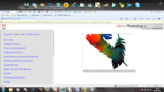
Once again I was back to square one... New updated Photoshop that I have no idea how to use. Thankfully Photoshop provided me with a simple "how to use Photoshop" which enabled me to follow a web link on Photoshop tutorial using a step-by-step set up technique,(www.Adobe\Photoshop CS\Help\help.html). To begin with experimenting with Photoshop seemed fun and I was feeling fairly ambitious & excited. I started to build the foundation of my film poster.
Clouds Background
From my previous Photoshop tasks they all have a similar pattern of using a plain background which had an element of dullness. I want more of a challenge for my film poster & film magazine. From my Research of Questionnaires to potential customers at my research stage almost all of them agreed that if I apply having an eventful & lively background they would be much more inclined to be interested about AMORE. Therefore I learned from this that I need to make my film poster look different, catchy and busy, I decided to have a background of clouds with a sense of obscurity with a slight sinister atmosphere theme. As you can see below originally I took some pictures of the sky with some clouds. Luckily the last few weeks have been fairly sunny so it gave me my perfect opportunity to test out my photography skills!
When taking these pictures in my head I knew they obviously couldn't be blue with happy approach on my film poster so I hoped to changed this on Photoshop which was a success. At first I just changed the shade of blue to a darker contrast & and red tint.... Unfortunately this did not fulfil the image of my background I had in my head so my work was cut out for me, trying to figure out how to make the clouds appear black!
Here is a copy of the original image, background image sky blue with cloud theme.


Here I have applied a darker contrast & a red tint, In my head this wasn't the colour i was hoping for so i was not fully satisfied... to me it almost looks like sunset coming and not the background foundation to a thriller film such as mine.
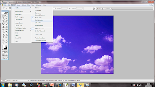 This picture makes Photoshop look fairly simplistic to use & navigate effectively. BUT the first few hours of reuniting yourself with Photoshop is not like this. I found using "layers" complex and at times confusing with such a simple task.
 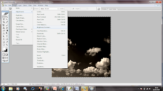 This is what I was aiming for! a dark background image with a inscrutability appeal!
Karman's Photograph- An awkward job of cutting her out for the background
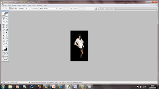
Very zoomed in for Maximum effect cutting out an actor for my film was very tricky due to the detail. As it was my first major task I attempted to experiment with all Photoshop buttons just to check it would look as professional as I could possibly make it. I found a number of similar buttons that to me done almost the same thing: To cut Karmann out I found the most appropriate tool which was the MAGNETIC LASSO TOOL...absolute life saver although I found it can be quite time consuming.
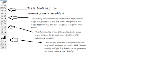
Here is a vague list of the button organisation for tools... originally I used this guild to help me when going through Photoshop.
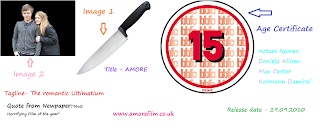
Here is a selection of other images & other desires I wanted my Film Poster to include please click on link on the image below:

No comments:
Post a Comment